Week 1
The idea of visual literacy is one that interests me greatly. In fact my own avenue of discovery in art from visual literature. I have always been drawn to visual stimuli from a young age and continue to cherish some of the children’s literature from my own childhood experiences. The works of Arnold Lobel, Mercer Mayer and Maurice Sendak in particular I continue to maintain a collection of and refer back to consistently. I was further hooked when introduced to comic books and gained a heavy, lifelong collection to carry with me. So my interest in and pursuit of art has always been focused on illustration. Indeed, it is clearly what led to my choice of this class.
Choice indeed is a difficult task in selecting what literature to work from within the scope of this class’s assigned tasks. My first instinct was to work within children’s literature, as most closely aligned with the kind of artwork I regularly produce. However, based on what text? I have no recent writings of my own, which led me to consider using historical fables, myths, or fairy tales. This felt like a good fit but seemed somewhat trite.
My next instinct was to work within the field of editorial illustration, thinking that it might lead to a good lesson with my art students. I am always looking for ways to frame my own interest in art as lessons, as I believe I get better buy-in from students when they can see my own passion for the subject. With students, it is always similar to my own predicament with this assignment: what to do? Simply selecting a news article and interpreting it visually seems like a good solution. There is though a pretty distinct genre-wide style to editorial illustrations that holds only a mild appeal to me, as my own style and interest in art includes a lot of rendering. Be it sculpting, drawing, or painting, my interest in art is heavily influenced by form and its illusion.
This left me with a final genre as presented within the context of this class, which was that of comics. It has been a lifelong interest and pursuit for me to attain the level of graphical rendering and anatomy necessary to produce comics. It is something that I have gone away from over the years, but something that none the less, I still desire to pursue. Led down this path, I still had to select a text to work from. As I hunted for a plot or script, a memory wafted up from the long-forgotten past of the Marvel Tryout Book. Originally published in 1983, the book describes the various roles of pencilers, inkers, colorists, letterers, plotters and scripters in the industry at the time. Each description contained appropriate pages to apply the craft and submit to Marvel Comics for prospective employment. I actually bought a copy myself when they made a newer addition in 1996 but at the age of 15 it never went anywhere. So I tracked down a copy of the original and am preparing to attempt using their plot examples to create penciled pages utilizing them. I think this will be something that holds my interest and provides a number of challenges, not the least of which will be design. Since this means utilizing known characters the design phase will be much more focused on the stylistic notes I want to incorporate rather than whole cloth creation. I encourage students consistently to do something original since much of the negativity felt by oneself and from others is relieved when only the creator knows what is wrong with it. So this is somewhat counter to that advice but I look forward to the challenge of it and hope I can meet my own standards for quality comic drawing. Included here is the page from the Marvel Tryout Book with all the page plot prompts for the penciler.
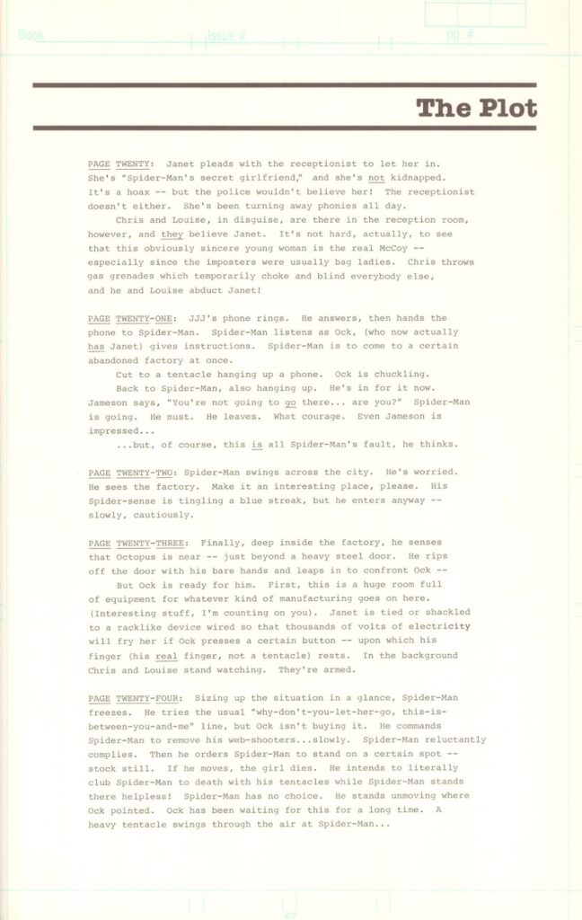
Looking at them I whittled down to page twenty-two’s prompt as it only requires designing for Spider-man and environment. All the other prompts would require many more character designs, some of which would be of whole cloth, and I think realistically as a full time public school teacher I just couldn’t do it justice. This prompt though felt achievable.
PAGE TWENTY-TWO: Spider-Man swings across the city. He’s worried. He sees the factory. Make it an interesting place, please. His Spider-sense is tingling a blue streak, but he enters anyway – – slowly, cautiously.
I think visual literacy is very concisely described by Brain Kennedy of the Toledo Museum of Art. Art as a language means that visual literacy is an understanding of the alphabet, vocabulary, and grammar of visual language (What Is Visual Literacy?, 2013). To muddle that metaphor, I will admit to a rather hazy understanding of English grammar and that my artistic progress is built through practice and instinct. Thinking about how one reads images as the juxtaposition of symbols, I imagine visual symbols as words in a sentence. Will Eisner describes comics as sequential art, with two or more images in sequential order from the art of comics (Eisner, 1985). To be literate in this form means being able to form a coherent narrative from these sequentially juxtaposed images. Scott McCloud, in his seminal text Understanding Comics, describes comics more distinctly as “Juxtaposed pictorial and other images in deliberate sequence, intended to convey information and/or to produce an aesthetic response in the viewer.” (McCloud, 1994). To me, it seems that comics are the clearest example of visual literacy. With the direct and intentional juxtaposition of images and text to complement one another for the explicit purpose of storytelling, it is hard to see what else it could be called. This leaves me feeling like my selection of text is appropriate, achievable, and justifiable.
Video of Thumbnail Creation
Finished Thumbnails
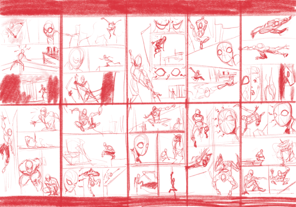
Having selected my text and with an understanding of visual literacy in mind, I set about the thumbnailing process. I like to do my thumbnails at a very small scale and to do all of them on one page. Seeing all of them helps me to ideate and synthesize better as I progress through the drawings. In the first thumbnail, I went for something simple, as I read a lot of comics and I find that many modern comics have very poor storytelling with too much emphasis on artistic flair and color rendering. Reading comics at night on my phone is frankly a pain in the neck to scroll all over the page to follow the story, and I much prefer comics from before the 1980’s. These comics are much more likely to utilize a grid system for the panels, and it is easy to read. So I went for this right away, using a six-panel grid. My second thumbnail, I think, has a good flow for the eye through the page, but I confused the plot description from another section, and Spidey is needlessly ripping a door off. In the third thumbnail, I try a different grid layout using a long vertical panel to open the page, even breaking the panel border with Spidey’s hand, and then try to stack the rest up vertically on the remaining area.
Marvel Comics current Editor in Chief C.B. Cebulski specifically says not to break panel borders in a tryout in the accompanying video, so this is probably a bad design (Is Your Portfolio Good Enough to Get You Hired at Marvel?, 2023). I do decide here though, that I will combine the directions to show Spider-man as worried and his spider sense tingling from here on, as in this design I see them as too similar. Next, in the fourth thumbnail, I try a more manga-inspired layout, and I am happy with the surprised look I get for Spidey. Any time something goes right, I then want to try radically different things, so I immediately discard that and try for the classic split-face Spider-man for that same story beat in the next thumbnail and experiment with a nine-panel grid. The sixth thumbnail returns to that long vertical panel, as it seems interesting to show Spider-man web-slinging through the city, and I return to my better concerned expression, this time pulling out to a medium shot to utilize some body language. Down to the last four thumbnails, I try to focus on adhering to a simple grid system and realize I need to better establish the warehouse that is supposed to be interesting. Additionally, in thumbnails eight and nine, I am also trying to better establish that Spider-man is entering the building cautiously. Finally, in thumbnail ten, I am synthesizing some of my best elements so far, and I develop a gesture for Spidey entering the building that makes good use of overlap to establish the physical entering of the space and a timid nature that fits with the plot description best. I feel thumbnails seven and ten are the strongest in terms of story and layout and will probably be further merged as I progress through the project.
Resources
What is Visual Literacy? (2013, November 19). YouTube. https://www.youtube.com/watch?v=O39niAzuapc
Eisner, W. (1985, April 1). Comics and Sequential Art. Poorhouse Press.
McCloud, S. (1994, May 6). Understanding Comics. HarperPerennial.
Is Your Portfolio Good Enough To Get You Hired at Marvel? (2023, October 10). YouTube. https://www.youtube.com/watch?v=dD6eQ4esQ2Q
Shooter. (1983). the Official Marvel Comics Try-out Book (1st ed., Vol. 1). Marvel Comics.
Week 2
Reference Board

Paul Pope Buildings Reference 
Paul Pope Buildings Reference 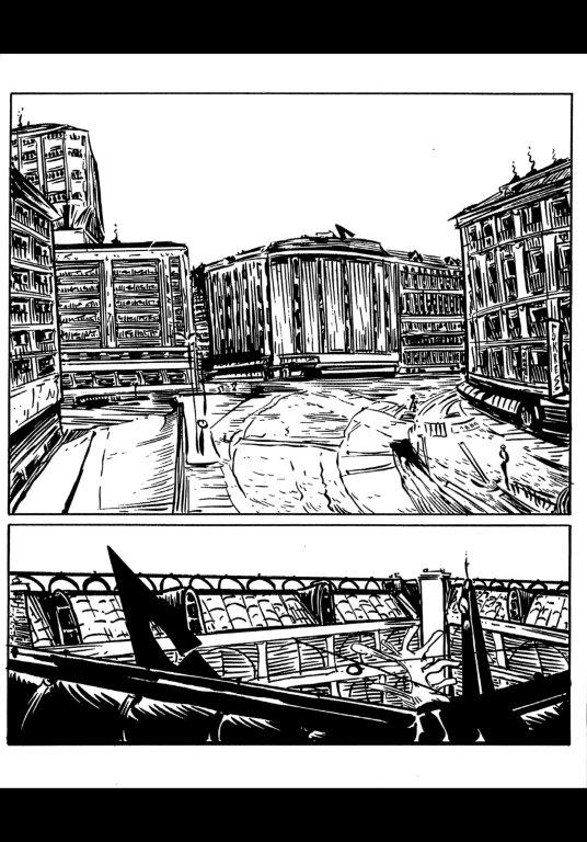
Paul Pope Buildings Reference 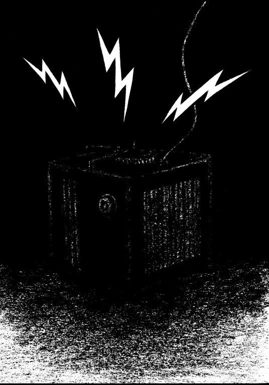
Paul Pope Buildings Reference 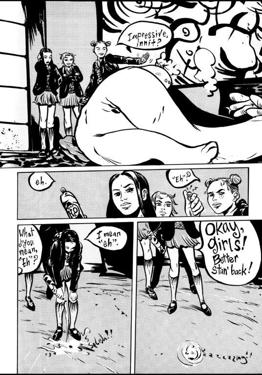
Paul Pope Layout Reference 
Paul Pope Buildings Reference 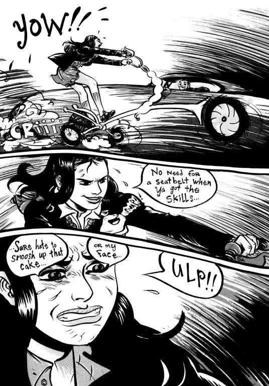
Paul Pope Layout Reference 
Paul Pope Buildings Reference 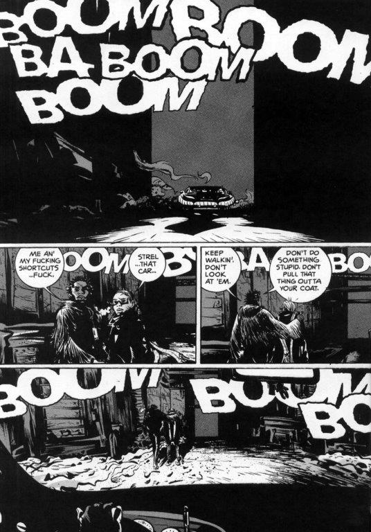
Paul Pope Layout Reference 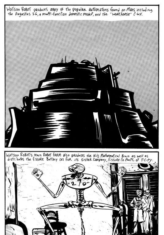
Paul Pope Buildings Reference 
Paul Pope Buildings Reference 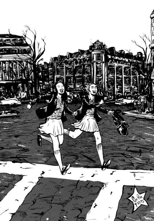
Paul Pope Buildings Reference 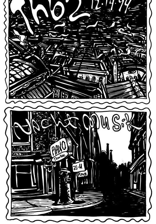
Paul Pope Buildings Reference 
Paul Pope Buildings Reference 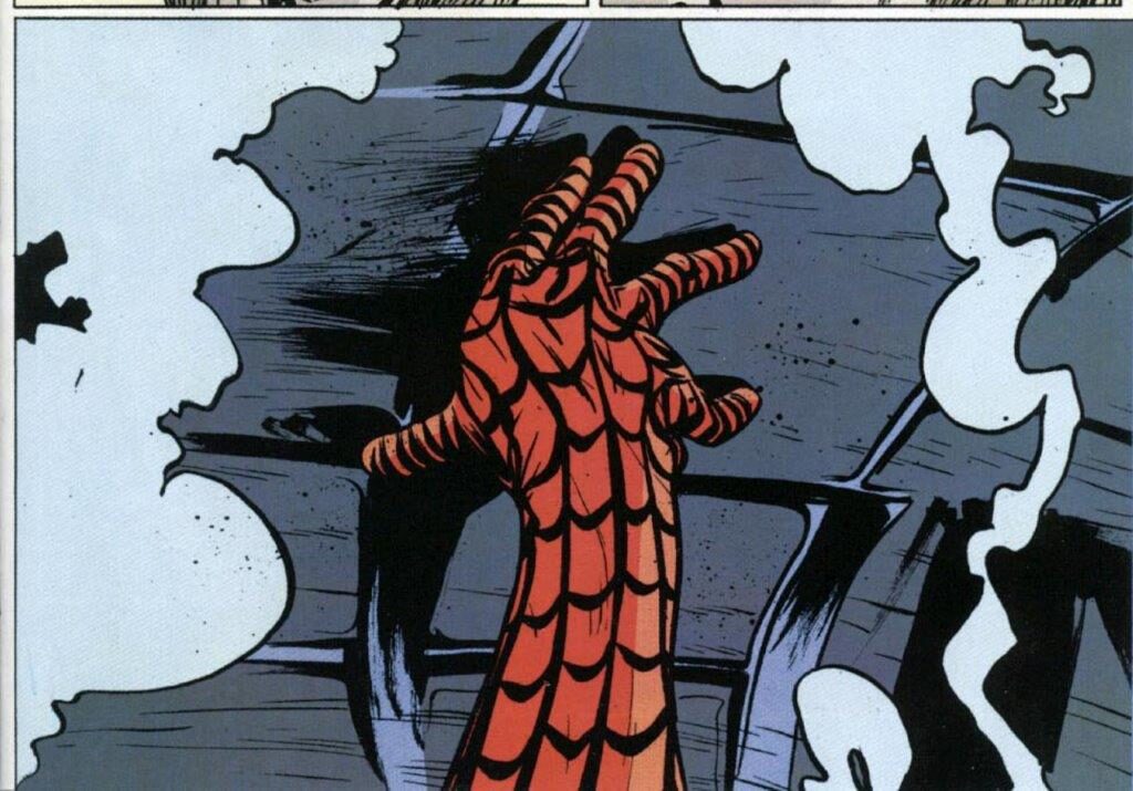
Paul Pope Spider-man Reference 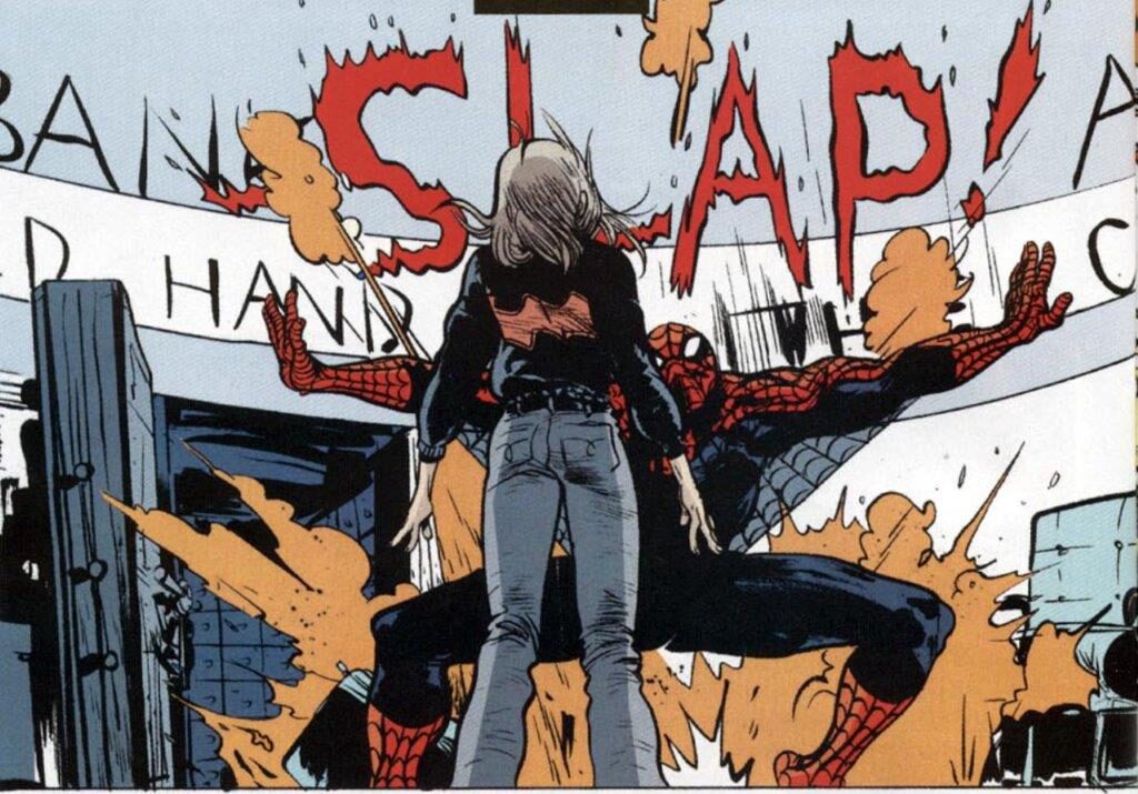
Paul Pope Spider-man Reference 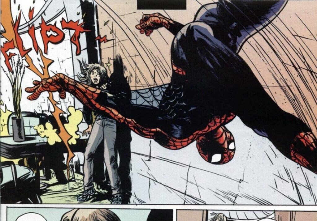
Paul Pope Spider-man Reference 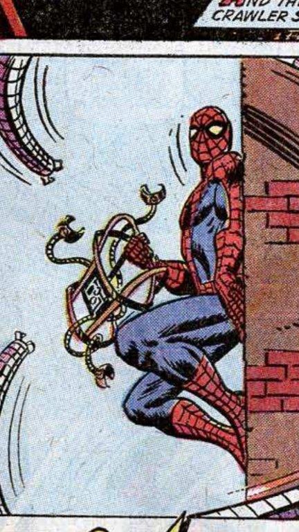
Genre Color, Lighting, & Pose Reference 
Genre Color, Lighting, & Pose Reference 
Genre Color, Lighting, & Pose Reference 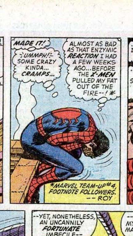
Genre Color, Lighting, & Pose Reference 
Genre Color, Lighting, & Pose Reference 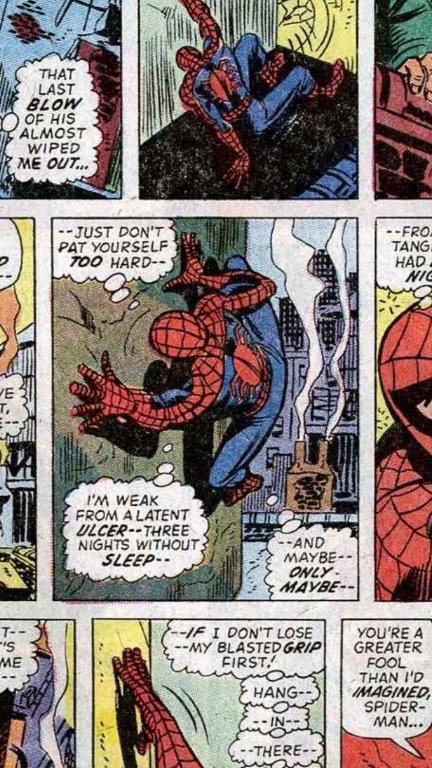
Genre Color, Lighting, & Pose Reference 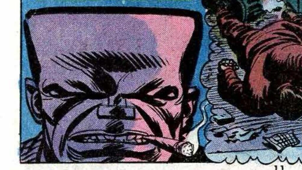
Genre Color, Lighting, & Pose Reference 
Genre Color, Lighting, & Pose Reference 
Mike Allred Spider-man Reference 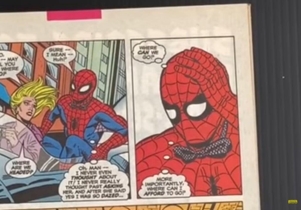
Mike Allred Spider-man Reference 
Mike Allred Genre Reference 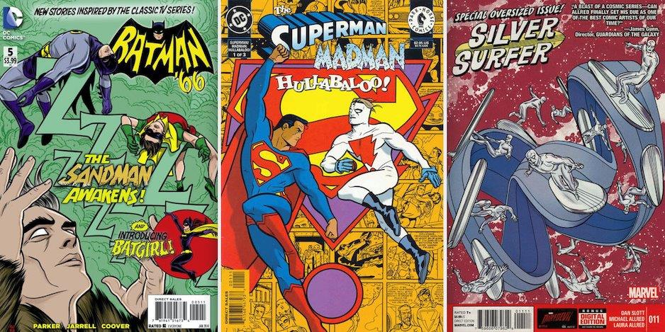
Mike Allred Genre Reference 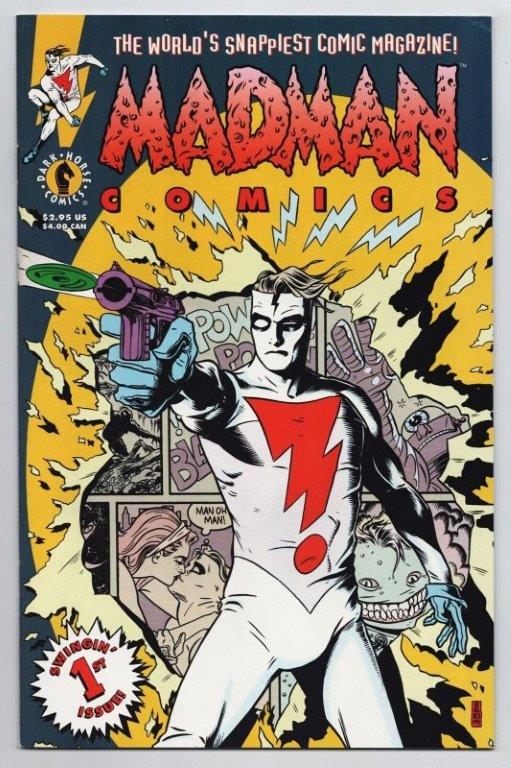
Mike Allred Genre Reference 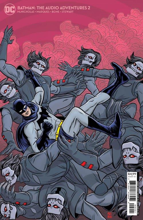
Mike Allred Genre Reference 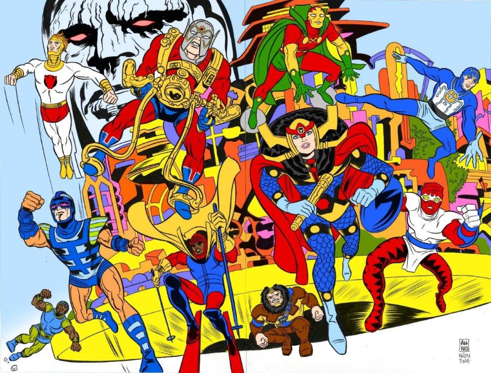
Mike Allred Genre Reference 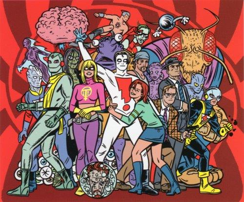
Mike Allred Genre Reference
Digital Drawing Exploration
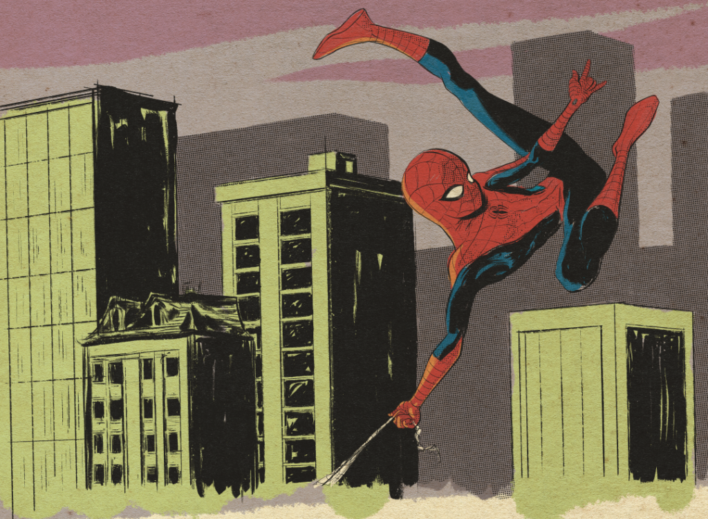
Process Video
Moving into phase two of this project meant a heavy consideration of style elements. Since the text I am working from is so specific and utilizes existing characters, my design contribution is to personalize the look to fit the story aesthetic I want to convey. There are some very clear inspirations for the style that I can point to, as these are defined by some of the artists that inspired me to learn to draw originally. This project has allowed me to do something I have always wanted to but never have done. Some time in the very early 90’s, my brother brought home some comics, soon followed by some from my father, and I was hooked. I bought and read a lot of comics after that, but when my daughter was born, I went through and got rid of ninety percent of them, keeping only work by certain artists. The ones whose work I had always aspired to. Now, with the task of illustrating a Spider-man page before me, it remains these artists whose styles I wish to synthesize. Chief among these artists are Paul Pope and Mike Allred, each of whom has done a Spider-man story themselves. I pulled some images from these issues to include in my reference board. Paul Pope is an independent comics illustrator most known for his personal works, THB, Heavy Liquid, 100%, and Battling Boy. He has a very distinct style, utilizing only a brush and sumi ink. I looked especially for examples of his work with buildings, as it’s something I particularly avoid. Most importantly, I want to incorporate his loose brush style into the work I produce here. Mike Allred is also a brush inker but has a much tighter style emphasizing clarity and excellent stylized anatomy that pulls from his own influences, most notably Jack Kirby. From Allred, I want to take the clear and dynamic posing of his characters. From a character design standpoint, I wanted to make my Spider-man appear to be a kid.
I like the original idea of Spider-man as a high school student trying to juggle his everyday life with the monumental responsibility of his powers. My thumbnails depict Spider-man as a generic superhuman, so I worked to create a more youthful proportion. You can see in the video of my process that I take some time to stop and specifically work on the head. I wanted to push for a more clear cartoon and manga-influenced style and had to work it out from a straight angle first. Finally, by increasing the head size, I achieved the look I was striving for.
Comics have moved away from the fairly consistent style dictated by the four-color process that produced them originally, but I don’t think it’s something better. The effect of using flat black to communicate the majority of the information is highly effective. These are symbols that need to be read quickly, and I chose to utilize this more traditional form for my work here. With some experimentation, I was able to develop a brush in Procreate that is giving me some of Paul Pope’s quick, loose brush work, best seen in the rendering of Spider-man’s body and the buildings behind him. This is an aspect that I am pleased with so far, and I think it is successful in achieving the style I am aiming for. I will say that doing this digitally, I find myself undoing and redrawing a lot of lines. Producing lines that are loose and appear to have the markings of a dry brush means getting the program to generate a lot of variations until you are satisfied. With real media, it is a question of control. The brush is dry if I dry it; it twists if I twist it. Digitally, it is somewhat random at best, and the only option is to roll the dice again. This is obviously only an issue in trying to replicate the look of physical media, so it is not so much a limitation of the tool as a headache because of the style I want to mimic.
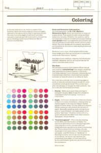
I also did some research to find color and lighting examples from Silver Age Spider-man comics. Using the color guide included in the Marvel Try-Out book, I decided to limit myself to the colors available in four-color printing at that point in comics history. I initially attempted to color my rough panel several times before deciding on this limitation, and I was much more satisfied with the result after applying some of the color choices I was seeing represented in the Spider-man comics themselves. I am attempting to mimic the look of a color guide with this work. I’d like to think of this page as a submission to Marvel as a penciler, inker, or colorist. At the time of the Marvel Try-Out book’s publication, colorists would have used P.H. Martin’s watercolor dyes to create guidelines for the printers to follow as they created the benday dots of overlapping four-color prints. I am much happier with the look of my rough since changing to this limited color palette, but I would like to better approximate the look of the water media the colorist would have used. Something to keep working on as I go forward.
In all, I think things are going pretty well. I am satisfied with the style I am able to produce and happy with the synthesis of elements that I was aiming for. If I can just keep it cohesive for the remaining panels of the complete page, I may have achieved success.
Week 3
Finished Artwork

Line is obviously a powerful element of design that plays near paramount in importance to comic illustration. I had a very clear vision for the line style that I hoped to achieve for this work, based on my influences. I was initially concerned that I would have difficulty mimicking the look digitally, and I in fact did. Working with Procreate’s built-in brushes, I was not able to create the line quality I was after. There was a textural quality imparted by the paper that was missing.
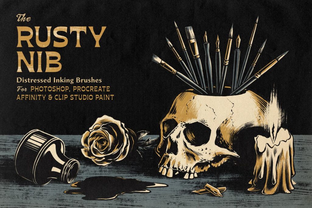
Initially, I was interested in diving into brush editing, but time would not allow it. A quick search led me to some premade resources, where I settled on the Rusty Nib collection of brushes from the True Grit Texture Supply Company. I could not more highly recommend this brush set to someone aiming to create traditional comic art digitally. There is a vast wealth of options available in the set that I have only begun to explore, but I was able to pull out a few that helped me immediately imitate the look I desired. The Rusty Nib brush collection also contained some watercolor brushes that I was able to use to create the coloring and help imitate the look of the color guides a colorist in 1983 would have created. Modern comics do still utilize a black ink line to some degree, but much of what used to be the job of the inker to communicate things such as depth and rendering has been usurped by the job of the colorist. I strongly wanted to take on this task with the intention of performing it under the restrictions of an artist attempting to use the Official Marvel Try-out Book in 1983. So though I began experimenting with color in my rough and exploratory phase, my focus was on making the illustration work with only the ink line. All rendering, depth cues, mood, and lighting needed to work with just black ink. Color would also be limited to what was available to an artist in the field in 1983, and I viewed it as helping only to enforce what line was already doing. I struggle with line weight, and you can see me going back multiple times in the process video to increase the line weight as I move through the piece. I must find it intimidating to start with thick lines, but by zooming out and evaluating the work, I would go back and increase line weight to help better emphasize depth in the work. Line also was an aid in expression for me. Spider-man is difficult to emote, having a full face mask covering his expressions. Obviously, this still leaves the eyes as a mode of expression, and I tried to utilize that to its fullest extent. Even still, I found that I was able to use the web pattern of his mask to stand in for eyebrows and mouth shapes in a way that I have not seen used in any Spider-man drawing. The traditional pattern of his costume gives you webs in just about these places, but they are usually placed in grid-like fashion. By adjusting them just slightly, I found they could subtly but greatly influence the expression of the character. I was surprised that I haven’t seen this before, as it just about lines up perfectly. The costume is a work of design genius on Steve Ditko’s part; it allows you to twist Spider-man into all kinds of poses, but the competing textured and plane areas help overlap to define depth and spatial relationships. I feel lucky to have inherited such great design work for this project.
The Rusty Nib brush collection also contained some watercolor brushes that I was able to use to create the coloring and help imitate the look of the color guides a colorist in 1983 would have created. Modern comics do still utilize a black ink line to some degree, but much of what used to be the job of the inker to communicate things such as depth and rendering has been usurped by the job of the colorist. I strongly wanted to take on this task with the intention of performing it under the restrictions of an artist attempting to use the Official Marvel Try-out Book in 1983. So though I began experimenting with color in my rough and exploratory phase, my focus was on making the illustration work with only the ink line. All rendering, depth cues, mood, and lighting needed to work with just black ink. Color would also be limited to what was available to an artist in the field in 1983, and I viewed it as helping only to enforce what line was already doing. I struggle with line weight, and you can see me going back multiple times in the process video to increase the line weight as I move through the piece. I must find it intimidating to start with thick lines, but by zooming out and evaluating the work, I would go back and increase line weight to help better emphasize depth in the work. Line also was an aid in expression for me. Spider-man is difficult to emote, having a full face mask covering his expressions. Obviously, this still leaves the eyes as a mode of expression, and I tried to utilize that to its fullest extent. Even still, I found that I was able to use the web pattern of his mask to stand in for eyebrows and mouth shapes in a way that I have not seen used in any Spider-man drawing. The traditional pattern of his costume gives you webs in just about these places, but they are usually placed in grid-like fashion. By adjusting them just slightly, I found they could subtly but greatly influence the expression of the character. I was surprised that I haven’t seen this before, as it just about lines up perfectly. The costume is a work of design genius on Steve Ditko’s part; it allows you to twist Spider-man into all kinds of poses, but the competing textured and plain areas help overlap to define depth and spatial relationships. I feel lucky to have inherited such great design work for this project.
Process Video
If you had asked me before this project which is the better medium, I would have undoubtedly said paper and pen over digital, but after going through the process, I can see some distinct advantages in digital. Certainly, the efficacy of the option to undo is of inescapable importance, but it was the flexibility in adjusting the artwork that I came to use again and again. After using selection tools and transformations in my rough, I went back to these techniques again and again throughout. I don’t think that digital tools make artwork better, but I do think that the ease with which the work can be adjusted means greater efficiency. Frankly, I don’t think I could have done as good a job physically in the time frame I had. The adjustments I made to my drawings would have needed to be entirely redrawing sections, tracing, and pasting up, which I could not get done sitting in the rocking chair of my daughter’s room each night. Any work of art is going to go through a process of revisions to help it better communicate its goal, working digitally by combining what would have been distinct versions and remakes into one continuous process.
Thumbnail to Final Comparison
PAGE TWENTY-TWO: Spider-Man swings across the city. He’s worried. He sees the factory. Make it an interesting place, please. His Spider-sense is tingling a blue streak, but he enters anyway – – slowly, cautiously.
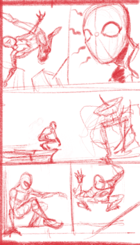
Thumbnails 
Finished Artwork 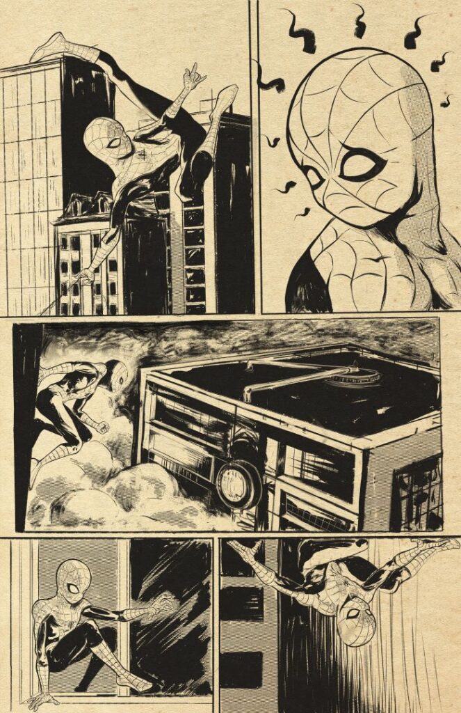
Inks 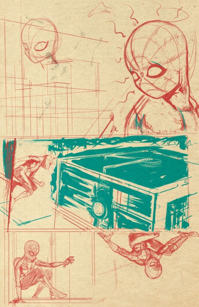
Pencils
It can be seen from my process video that this was a fairly straightforward illustration. It was in my initial thoughts beginning this undertaking that I vacillated, but once I decided upon the text and the constraints and styles I would work within it, it was a process of accumulation. The thumbnailing process was very effective in helping to elucidate what was needed and remove weak elements. So much so that by the end of that process, I had what I felt was an effective composition, and it became more of a task of rendering out the finished product. In fact, in one of the panels, I copied out my thumbnail and enlarged it before doing finished pencils over top. That was super effective, and I would be interested in doing more using that process in the future. As you can see by comparing the thumbnail to the finished artwork, the overall layout is almost identical. Only details are differentiated. Items like the “interesting” factory evolve from the loose suggestions of the thumbnail into the finished work. The factory was difficult, with architecture not being an illustrative interest for me. You can see in the process video that I return multiple times to embellish and clarify the structure. Hopefully it is interesting. I am quite happy with the finished work, but there are elements that I would change or at least do differently in future work. For example, I would like to have created a greater variety of sizes for Spider-man from panel to panel. In three out of five panels, he is roughly the same size, and I think the page would be more interesting visually with a bit more zooming in and out. I do think that, from a standpoint of visual storytelling, they are effective. It is probably an example of what John Romita Jr. calls “deadline style.” In other words, at the pace you need to produce comic book art, you’re going to have to make some quick decisions, and some things are going to have to be good enough.
I have loved doing this work. It is work that I have always wanted to do but haven’t. I think I will do more.

