Perspective
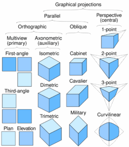
Linear or point-projection perspective (from Latin perspicere ‘to see through’) is one of two types of graphical projection perspective in the graphic arts; the other is parallel projection.[citation needed][dubious – discuss] Linear perspective is an approximate representation, generally on a flat surface, of an image as it is seen by the eye. Perspective drawing is useful for representing a three-dimensional scene in a two-dimensional medium, like paper. It is based on the optical fact that for a person an object looks N times (linearly) smaller if it has been moved N times further from the eye than the original distance was.
The most characteristic features of linear perspective are that objects appear smaller as their distance from the observer increases, and that they are subject to foreshortening, meaning that an object’s dimensions parallel to the line of sight appear shorter than its dimensions perpendicular to the line of sight. All objects will recede to points in the distance, usually along the horizon line, but also above and below the horizon line depending on the view used.
Italian Renaissance painters and architects including Filippo Brunelleschi, Leon Battista Alberti, Masaccio, Paolo Uccello, Piero della Francesca and Luca Pacioli studied linear perspective, wrote treatises on it, and incorporated it into their artworks.
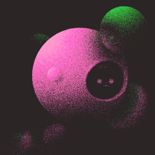
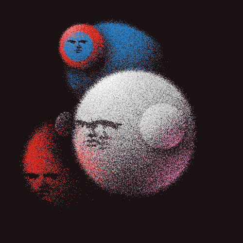
Form
Form is a three-dimensional object with volume of height, width and depth. These objects include cubes, spheres and cylinders. Form is often used when referring to physical works of art, like sculptures, as form is connected most closely with those three-dimensional works.
Opaque Painting
Watercolor
Artist Info
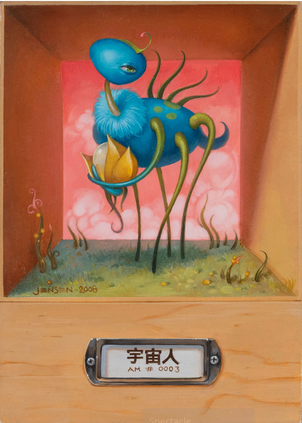
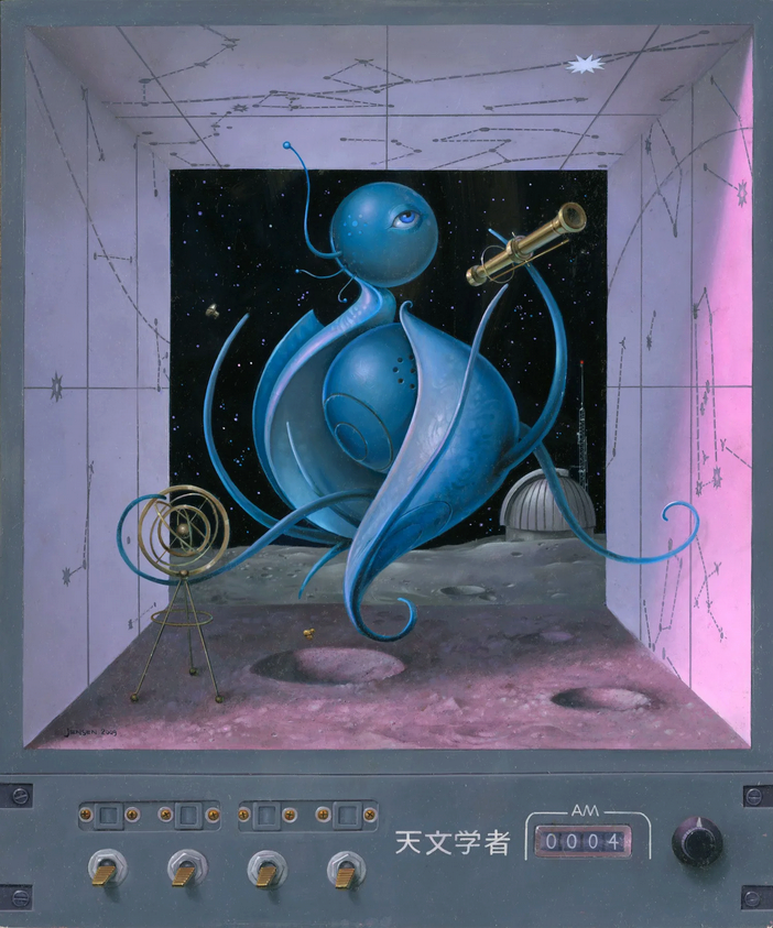
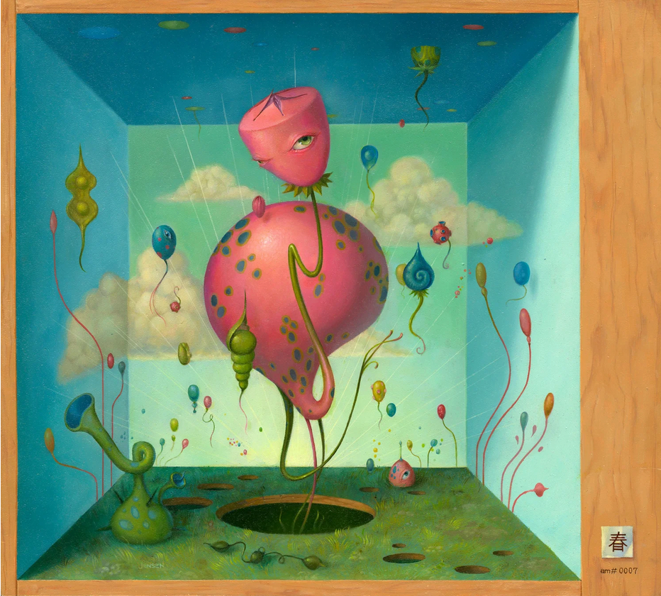
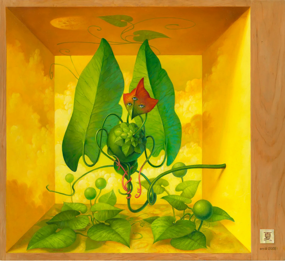
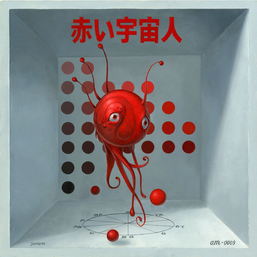
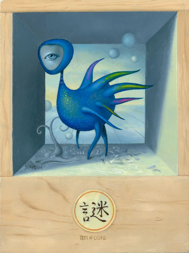
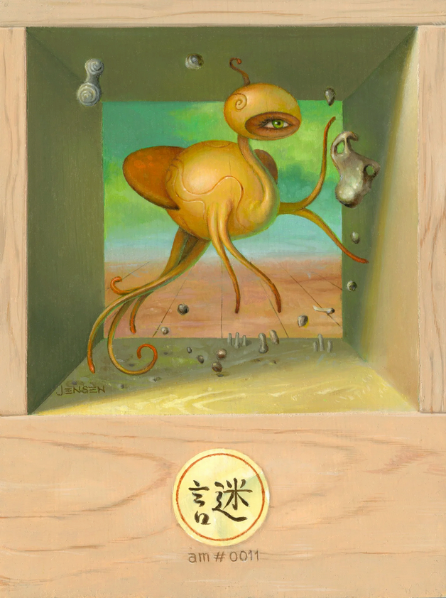
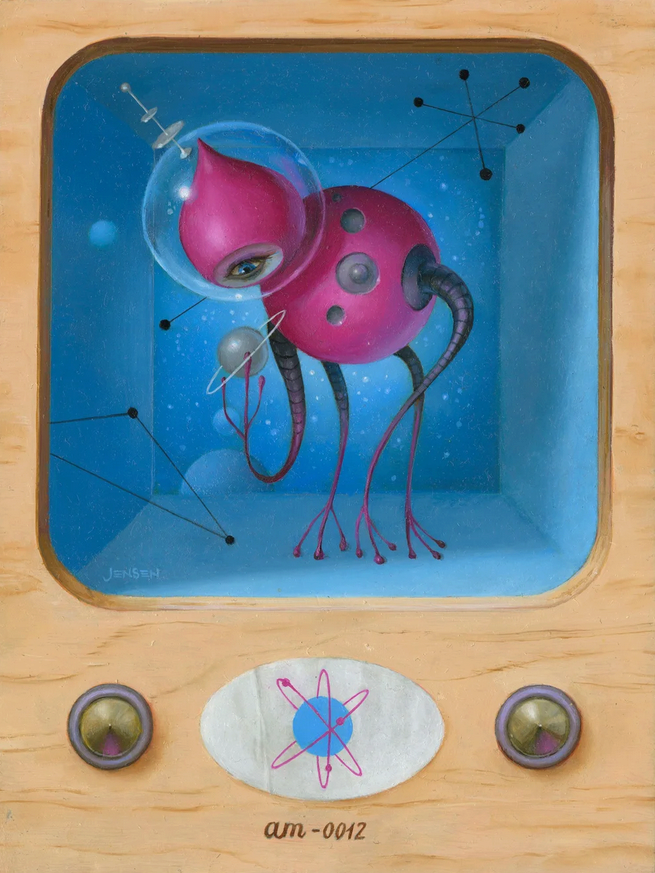
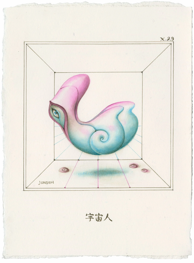
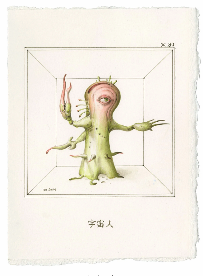
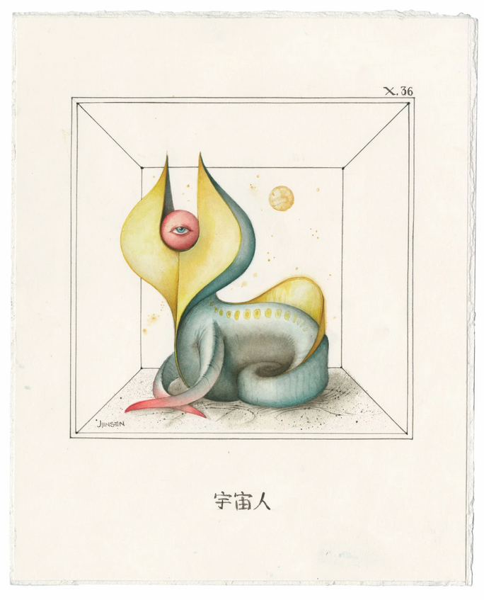
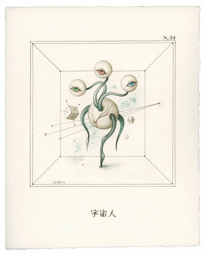
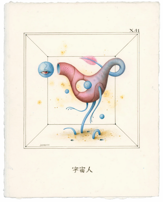
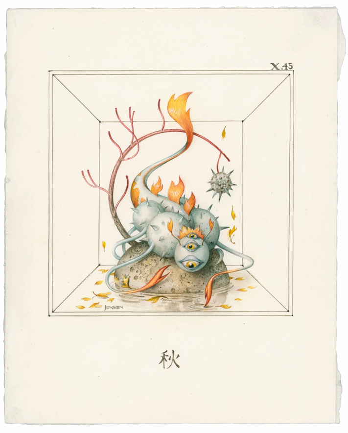
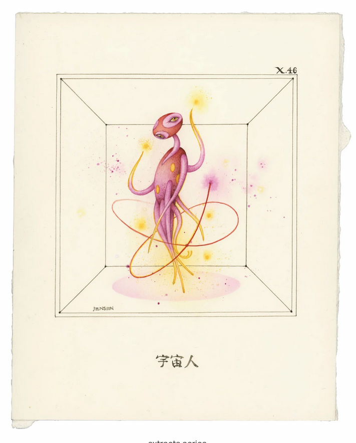
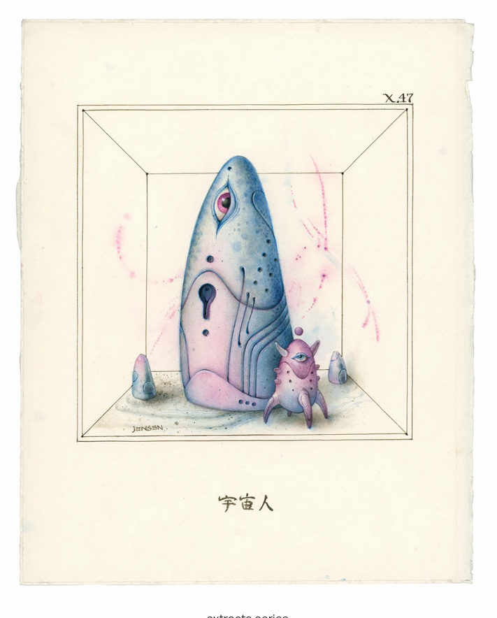
Bruce Jensen began illustrating covers for science fiction novels after his graduation from the Columbus College of Art and Design in 1984. Clients included Berkley publishing, Bantam Spectra, Ballantine Del Rey, Penguin/Roc, Tor Books, the Science Fiction Book Club, Marvel Comics, DC Comics, and Omni magazine. His artwork has graced the covers of books by Philip K. Dick, Neal Stephenson, Bruce Sterling, Robert Silverberg, Robert Heinlein, Arthur C Clark, Joe Haldeman, Pat Cadigan, Frederick Pohl, and A.E. Van Vogt among many others. His illustration work can be seen in Spectrum: the best in fantastic art volumes 1-13, 15, 18, 20, 25, IBA 7 & 8, Infinite Worlds, and Illustrators 35 & 40.
At present, he is the art director and illustrator for the news magazine 60 Minutes.
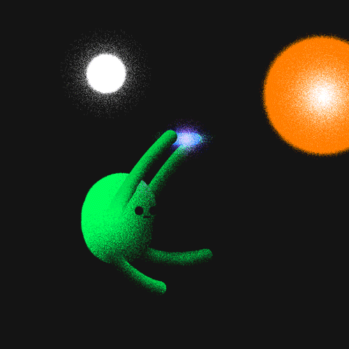
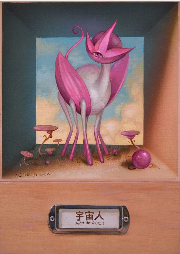
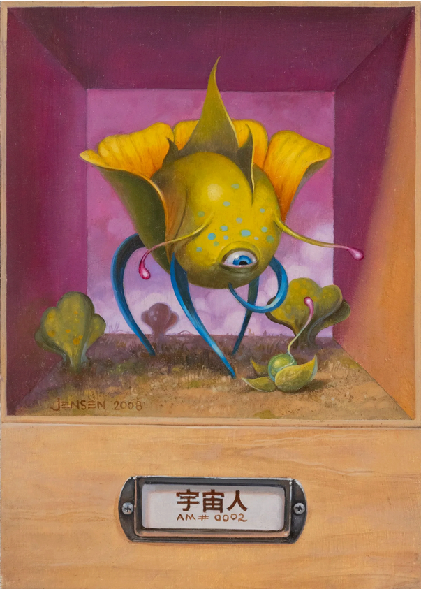
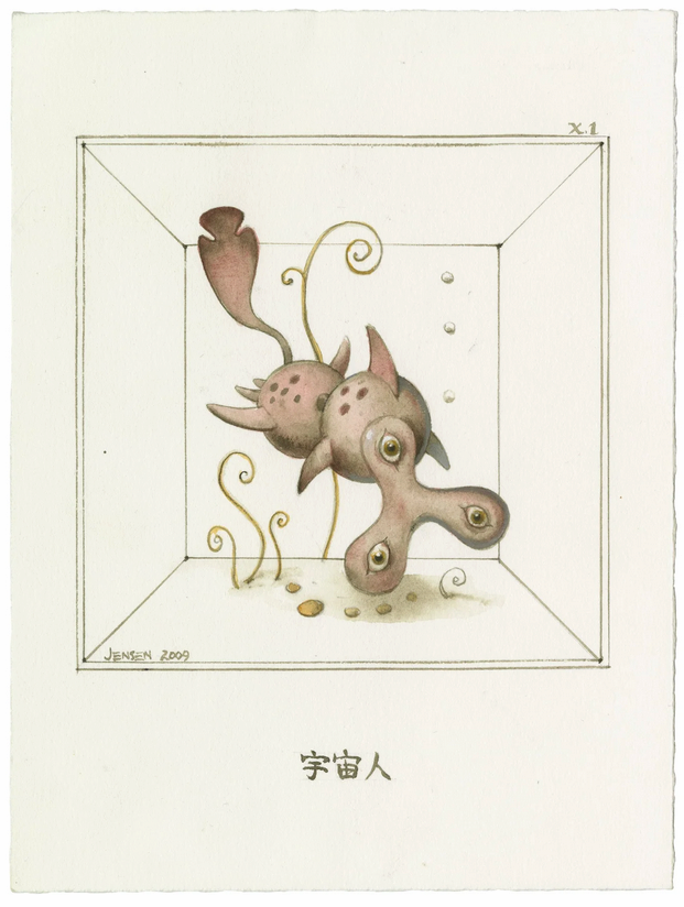
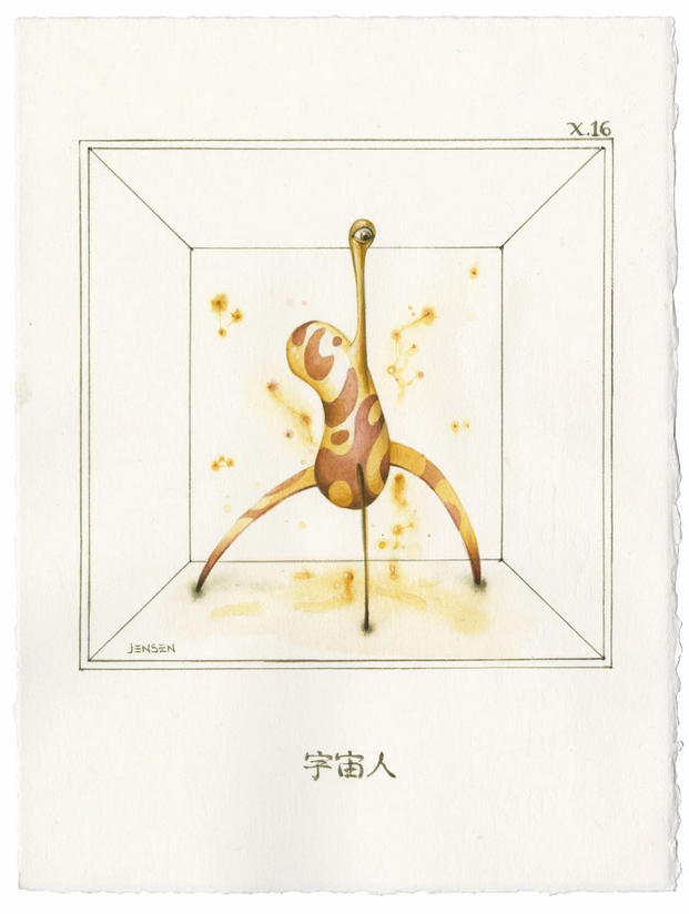
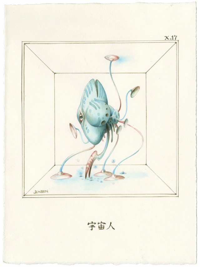
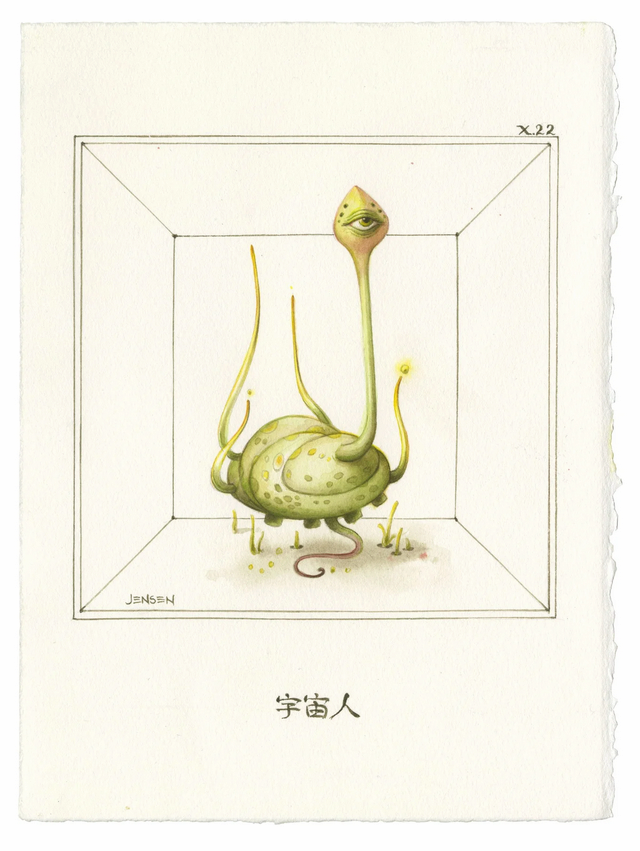
Whenever possible, he’s working on cataloging a vast array of fantastic and surreal aliens in his ongoing ALIEN MENAGERIE project.